Neutral Color Guide
Written by Julian Heisler
Neutrals are often seen as the safe choice — the quiet backdrop that lets everything else shine. But in reality, choosing the right neutrals can completely change the way a room feels. A soft beige can make a space feel warm and grounded, while a cool grey can bring stillness and calm. The right tone can make natural light feel softer, textures feel richer, and your home feel more intentional.
When decorating with neutrals, the key is subtlety. Not all whites are the same, and not all greys are created equal. Every neutral carries an undertone — some lean warm, others cool. Even a shade that looks simple on a paint chip can shift dramatically depending on the light in your space. That’s why it’s worth slowing down, testing samples, and seeing how each color behaves throughout the day. Morning light tends to highlight cooler tones, while warm afternoon light can make everything feel golden.
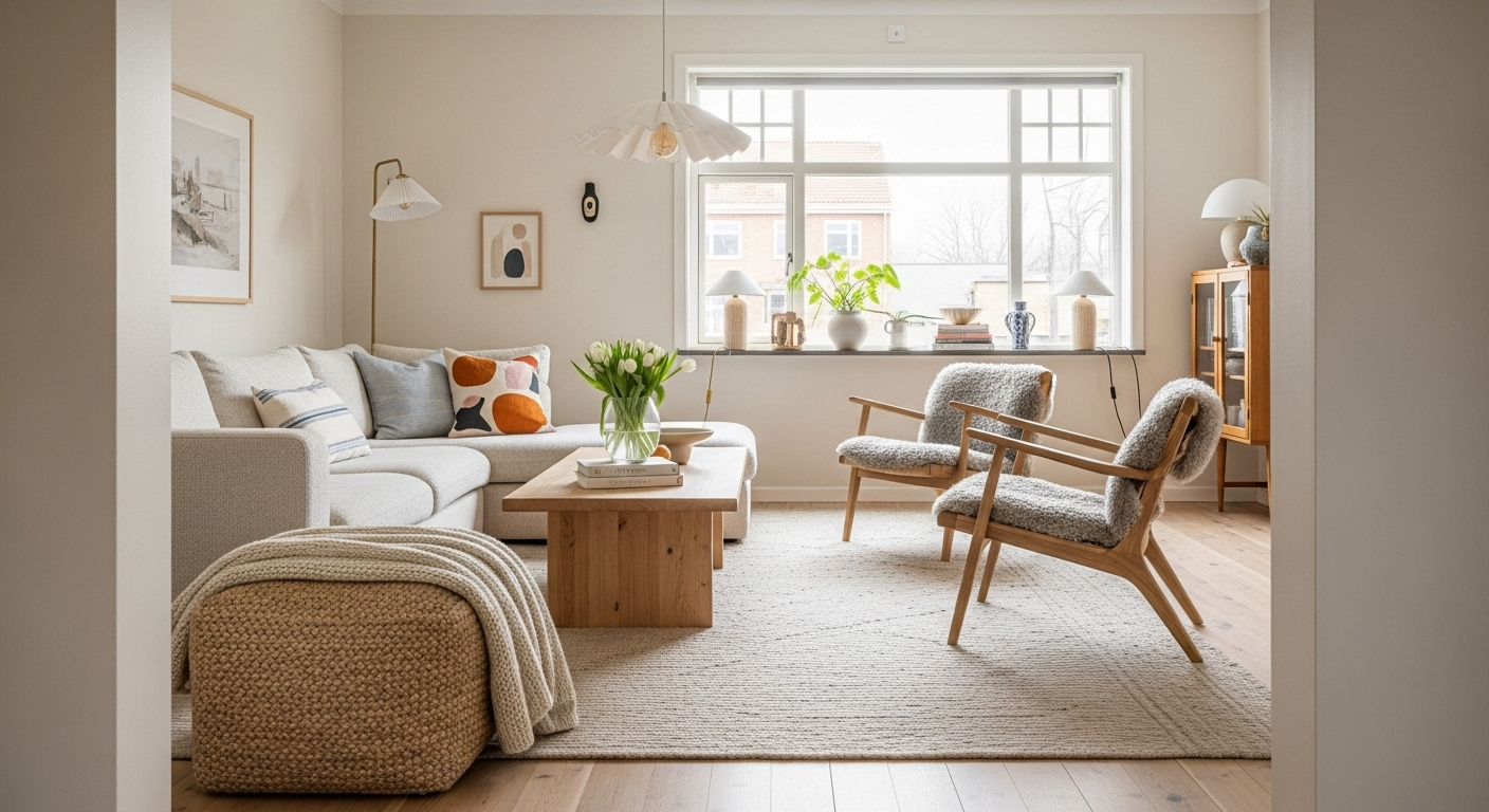
Warm neutrals — think sandy beiges, greige, and soft oatmeal — create a cozy, lived-in atmosphere. They pair beautifully with natural textures like oak, linen, and jute. These tones work well if you want your space to feel grounded and tactile. Cool neutrals — like soft dove grey, stone, or muted taupe — create a cleaner, more refined feel. They tend to work best in bright, sunlit spaces or in homes with modern lines and lots of glass or metal accents.

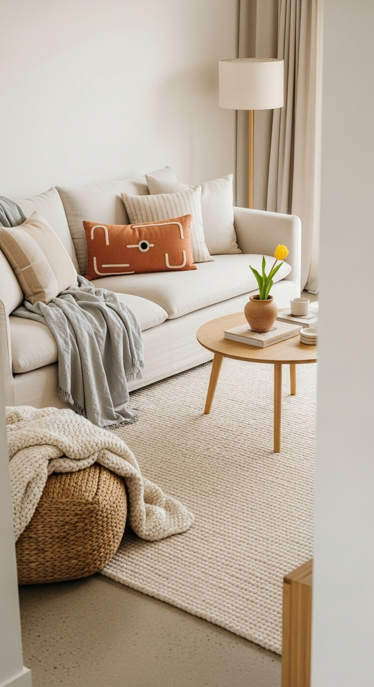
Layering different neutrals adds depth without breaking the calm. Instead of one flat tone, try working with subtle variations — a warm white wall, a taupe rug, a pale wood table, and a few black accents for contrast. This creates a space that feels thoughtful and dimensional, rather than monotone. Texture also plays a huge role in making neutrals feel alive. A wool throw, a raw ceramic vase, a linen cushion — these small shifts in surface catch light differently and keep the space from feeling too polished.
Don’t be afraid of contrast, either. Neutrals don’t have to mean pale. Adding a darker tone — a charcoal sofa, a walnut frame, or even a black lamp base — can anchor a room and make the lighter shades feel more luminous. It’s all about balance: enough variation to keep things interesting, but not so much that the calm gets lost.
Here are a few timeless neutral combinations to try:
Warm and Earthy: oatmeal, clay, and light oak.
Soft and Modern: stone grey, chalk white, and black accents.
Natural and Airy: linen, sand, and bleached wood.
Classic Contrast: warm white, tan leather, and deep charcoal.
If you’re unsure where to start, look to what you already own. The color of your flooring, your furniture, even your favorite pieces of clothing can guide you. Neutrals are deeply personal — what feels “calm” to one person might feel cold to another. The right palette is the one that makes you feel at ease in your space.
In the end, neutrals are less about color and more about feeling. They create a quiet foundation — a space that allows light, texture, and small moments to stand out. The goal isn’t to make everything match, but to create harmony. When done right, a neutral palette doesn’t fade into the background; it simply lets your life take center stage.


